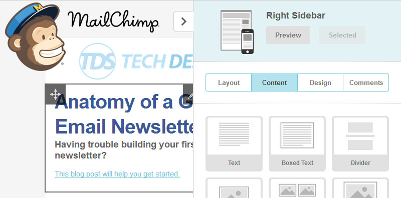
Having trouble building your first email newsletter? This checklist will help you get started: Part A – Newsletter Details – This is the first thing to consider because this information will decide whether or not your recipients actually open and read your newsletter(s).

- From Name – Choose something easily recognizable to recipients such as your company name and use it consistently.
- Subject Line – Encourage your audience to open the email with an informative, intriguing subject line.
Part B – Newsletter Design
- Logo and brand – Position your logo in the top-left corner of your email newsletter so recipient’s can quickly identify your branding. *Make sure you also make it a link so they can access your website* You only have 51 seconds (the average amount of time someone spends on an email newsletter) to grab a reader’s attention.
- Quick scanning and navigation – Include an ‘In this issue’ section with article headlines that link directly to the article content below. *This is particularly important for lengthy newsletters*
- Eye-catching headings – Format headings using font size and color to stand out from the rest of the newsletter content. *For quick scanning*
- Appealing imagery – Use images that are relevant to the content and enhance both the design and the call to action. Include alt text in case the images don’t display in the recipient’s inbox by default. *Consider Pinterest and Instagram* Don’t sell yourself too early, people do business with people they know, like and trust. The focus of your email newsletter should be to educate and build rapport with your fan base of readers. Want to promote? Send sales-specific emails separately.
- Create a dialogue with customers – Include options for your recipients to contact you and provide feedback.
- Social sharing – Include social sharing options that allow recipients to quickly share your newsletter with their own networks. Also link to your social media pages so that email subscribers can easily connect with you.
- View email online – This link is best positioned at the very top of your email newsletter and should direct recipients to an online version of your email in case of inbox display issues. If a reader doesn’t know immediately what’s in store for them, he/she won’t be bothered to scroll past the top fold.
- Call to action above the fold – Place your main call to action within the top 400 pixels and make it easy to find without the need for scrolling. *Experiment using both text and images with your call to action*
- Valuable, interesting and relevant content – Personalize content so it is relevant to your audience. Send content that your audience will genuinely be interested in. *Quality >Quantity*
- Separate key messages with color – Use color that is consistent with your company branding as a way to break up newsletter content into smaller, more easily scanned sections.
- Calls to action throughout – Increase the likelihood of recipients taking action when reading your email by including multiple calls to action throughout. *Use a mix of text and images as your calls to action and hyperlink them to relevant landing pages where appropriate*
- Update preferences and unsubscribe – Include links for subscribers to update their profile or unsubscribe and make sure they’re easy to find. *Usually these links are placed somewhere at the bottom of your email newsletter*
Hopefully this list provides you with the necessary information to send your first email newsletter. Let us know if you have any questions in the comments below! Need inspiration for your design? Here’s what other MailChimp users are doing.


